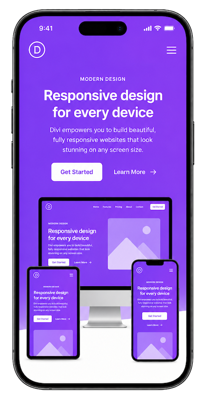
Reordering Content For Better Mobile Layouts
On desktop, your columns look perfect side by side. But when they stack on mobile, the wrong element lands on top — and visitors leave. Divi 5's Flexbox order property fixes this in minutes, without touching a line of CSS.
Reordering Content For Better Mobile Layouts
Three rows of image–text pairs look elegant on desktop, but when they stack, rows 1 and 3 put images first while row 2 puts text first — breaking the visual rhythm. Flexbox order fixes row 2.

Consistent visual flow starts with the right default
When your image is already on the left on desktop, stacking on mobile naturally places it first — which is exactly where you want it. No Flexbox intervention required for this row.
Think of this as your baseline. Rows 1 and 3 follow this pattern, so they behave correctly on mobile without any extra configuration in Divi 5's Flexbox order panel.
The reversed row: text left, image right
This row flips the pattern for visual variety on desktop. But on mobile, the natural stack puts this text above the image — breaking the image-first rhythm that visitors expect. Skimmers see a wall of text before they see anything visual.
Mobile stacking problem: Without reordering, text lands on top here. The solution is to set the image column's Flexbox order to -1 (or 0) on the mobile breakpoint in Divi 5, pulling it above the text in the stacked layout.


Back to the original rhythm for consistency
Row 3 mirrors Row 1. The image is already on the left, so when mobile stacking kicks in, it lands on top naturally. Your three-row section now has a consistent image-first flow on every screen size.
With only one row requiring a Flexbox order adjustment, your mobile visitors get a coherent, visually engaging layout — without any CSS overrides or duplicate content.
Your most important card isn't always in slot one
On desktop your card grid looks balanced at 3 columns. On mobile they stack — and if your featured card sits in slot 2 or 3, it gets buried. Flexbox order rescues it to the top.

Building a design system that scales
Tokens, components, and documentation — the three pillars of a design system that your whole team can actually use and maintain over time.
DESIGN

Why mobile-first layout changes everything
When you design for the smallest screen first, your decisions become deliberate and your hierarchy becomes clear. The desktop layout is an enhancement — not the default.
FEATURED

Performance is a feature, not an afterthought
Every second of page load costs conversions. Here's how to audit your Divi 5 site for speed and eliminate the common culprits that slow things down.
PERFORMANCE
When the sidebar should come first on mobile
A desktop sidebar that holds a key call-to-action or contact form gets buried under your main content when the layout stacks. Flexbox order surfaces it to the top where it actually gets seen.

Display order gives you layout control at every breakpoint
In a traditional CSS layout, source order is destiny — whatever comes first in the HTML renders first on screen. With Flexbox, you can decouple visual order from DOM order and serve a different hierarchy to each device.
Divi 5 surfaces this through its Flexbox order panel, letting you set per-breakpoint order values directly in the visual builder — no custom CSS required. Assign a lower value to pull an element up; a higher value pushes it down.
Get a free Divi Layout Pack
12 mobile-optimised section templates with Flexbox order pre-configured for every breakpoint.
In this series
Part 1 – Flexbox fundamentals
Part 2 – Flex containers and items
Part 3 – Alignment and justify
Part 4 – Wrapping and gap
Part 5 – Reordering content ← you are here
Build mobile-first layouts in Divi 5 today
You've seen how Flexbox order transforms five common layout patterns. Now apply it in your own builds — the visual builder makes it effortless.
Divi Visual Builder
MOBILE ORDER 2
Divi Visual Builder
MOBILE ORDER 2
Mobile Preview
Mobile order 1 — order: -1
Flexbox Controls
Mobile order 3
How to set Display Order per breakpoint in Divi 5
Follow along with this three-column layout — a Feature Image, a Text Block, and a CTA Panel. On desktop they sit side by side. On tablet the CTA moves above everything. On phone the image rises to the top. Each step shows you exactly what to click in Divi 5.
Mobile Optimization
By adopting a mobile-first design approach, you not only cater to your audience's preferences but also improve your search engine rankings, making your content accessible to a wider audience. Focus on mobile optimization to create a welcoming and user-friendly experience that resonates with today's mobile consumers.
Join thousands building websites they love.

CONTACT & SUPPORT
Phone
1-800-DIVI-HELP
Email
support@divi.com
Live Chat
9am–6pm EST